- Bonkers T-Shirts
- Warminster, Wiltshire
- www.bonkerstshirts.co.uk
Bonkers T-Shirts
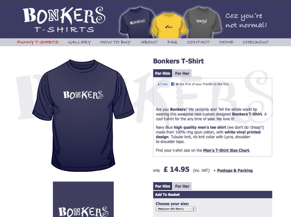
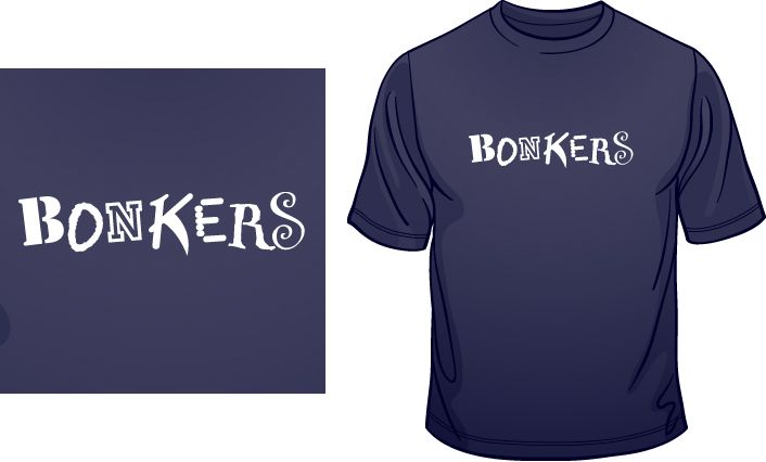
It would feel wrong to design a logo for this 'bonkers' t-shirt retail brand, without it actually looking a little bit crazy at least!
This logo really had to be a “Does what it says on the tin!” style of design. Anything else just wouldn't have felt right.
So it seemed natural to basically made every letter of the logo a different font, and make sure each one was significantly different from the last. But without making it unreadable. And then by adding a little bit of rotation per character, gave it some life as well.
Additionally, as the fonts were all quite chunky (not too much tiny detail) it would look great screen-printed on an actual t-shirt.


