
- Cheap Coal
- Wolverhampton, West Midlands
- www.cheap-coal.co.uk
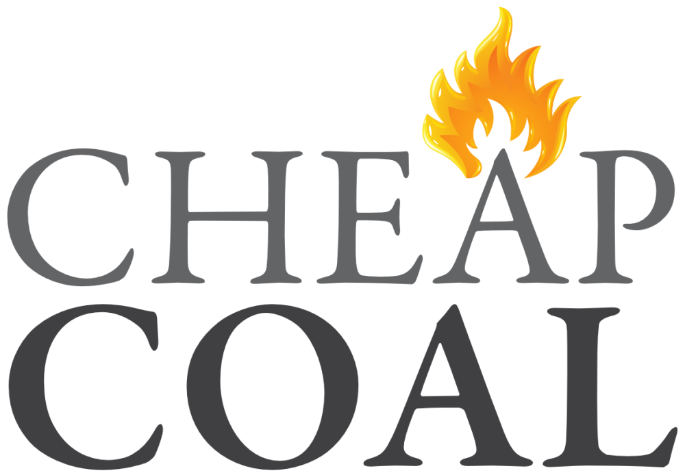
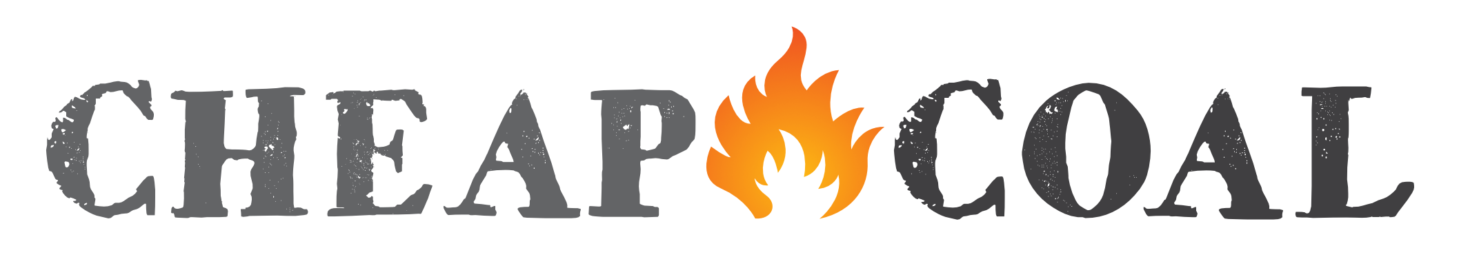
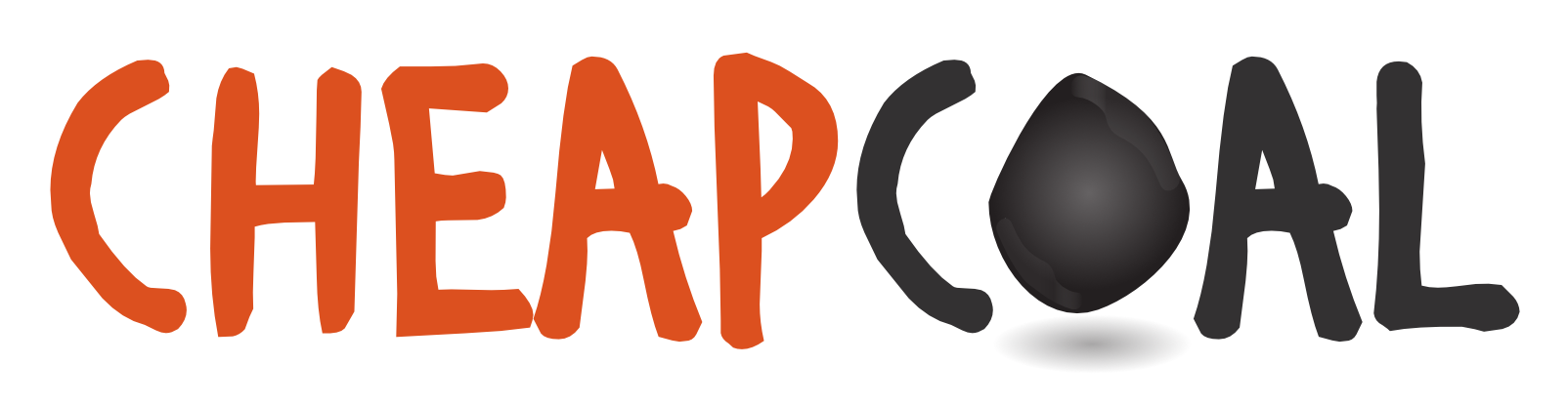
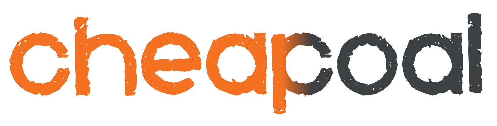
Cheap Coal
It felt like there could be hundreds of possible options for this company's logo and we struggled to choose the most suitable from our concepts.
We wanted to give this online coal and fuel retailer a modern style, and it felt right to use warm and bold colours, so we leaned towards the orange/red fire theme.
Although maybe a little obvious - and sometime ‘obvious’ just works! - the dark grey/black of coal also felt like a natural choice. So we played with various fonts and arrangements of these ingredients to create the concepts here.
Some of the fonts were a bit more ‘fun’ than people might be used to, so ultimately we think the right logo won in the end. A solid looking brand without being too ‘out there’, while still conveying warmth and modernism.
What does your brand say about you?
Take the first step now
