

- Posh Soaps
- Warminster, Wiltshire
- www.poshsoaps.co.uk
Posh Soaps
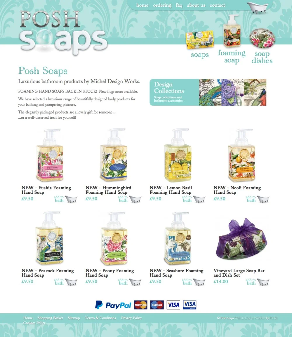
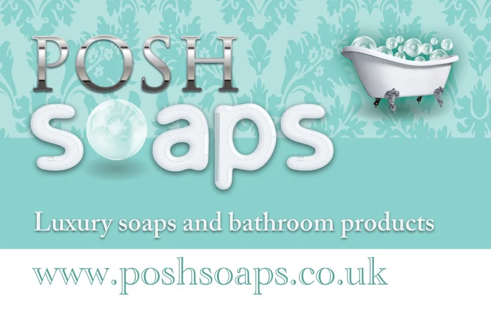
I'm sure this is a topic for much debate amongst branding designers, but sometimes it just feels like the name of the company / product can dictate how the logo should look.
Sometimes being abstract is great. Sometimes doing the opposite is clever. But often, being quite literal or representative, will work really well. This is one of those times.
The idea was make “Posh” look posh, and the word “Soaps” look soapy. So we opted for a style of lettering that was reminiscent of old bathroom chrome taps and bath fittings. Coupled with a rounded white soft adaptation of another font, to make soapy lettering.
And using a pearlescent soap bubble for the ‘o’ felt like a nice motif that could be easily used across all other marketing media.
Since then, we have used bubbles and an old roll-top victorian bath as features on the website and other advertising materials.
The shades of the teal colour also features prominently across all media. Overall a nice strong brand that stands out from the competition, and will stand the test of time.


What does your brand say about you?
Take the first step now
