
- The Period Metal Window Company
- Malmesbury, Wiltshire
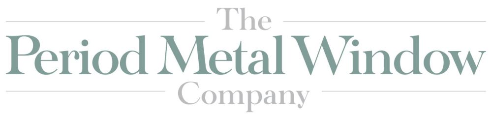
The Period Metal Window Company
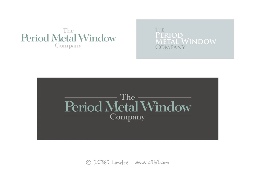
Creation of new logo to embody class of the products supplied into the company brand
The goal of this branding design project, was to create a new logo for the business that really contained the class and quality of the home windows being supplied and fitted, as well as targeting the market expectations, in terms of visual style for heritage building products and period properties.
Having studied some other brands in various sectors, the ‘heritage’ colours were definitely a strong contender so we looked at various options and combinations to make those work, in addition to looking at font styles.
A classic style serif font seemed to work really well, so we experimented with some nice typography to make the relatively long company work, whilst focusing on the “Period Metal Window” portion to grab people's attention.
We're really happy with the final result and it seems to work well on both white and a dark grey background.
What does your brand say about you?
Take the first step now
